An idea, a brand, a website
Curious about the process of building a brand for a web design agency, I initiated the Wellosite project.

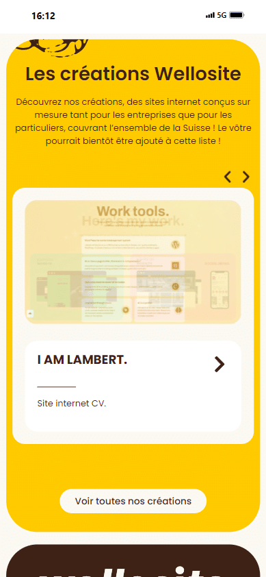
Website
Curious about the process of building a brand for a web design agency, I initiated the Wellosite project. The name, a whimsical blend of "sunflower" and "site", emerged organically.
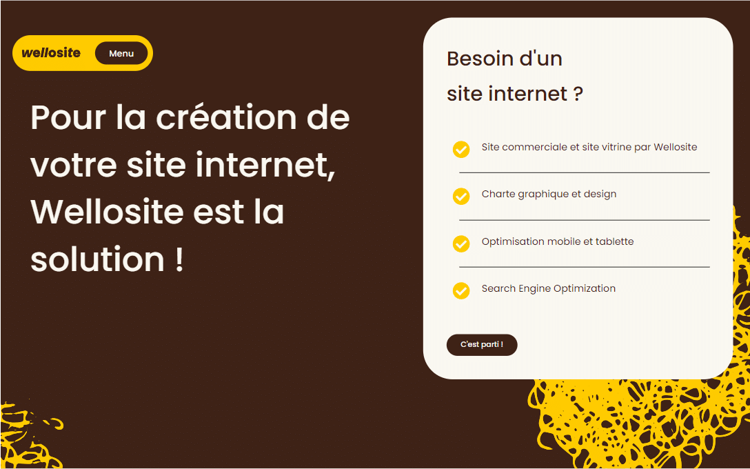
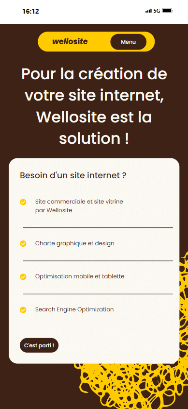
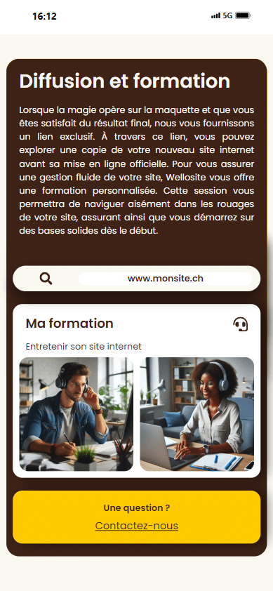
In designing the Wellosite website, I aimed for a perfect balance of simplicity and dynamism. My primary focus was on creating an intuitive interface that would be easily navigable for novices in the field, while also offering an aesthetically pleasing experience for all visitors.
Competences
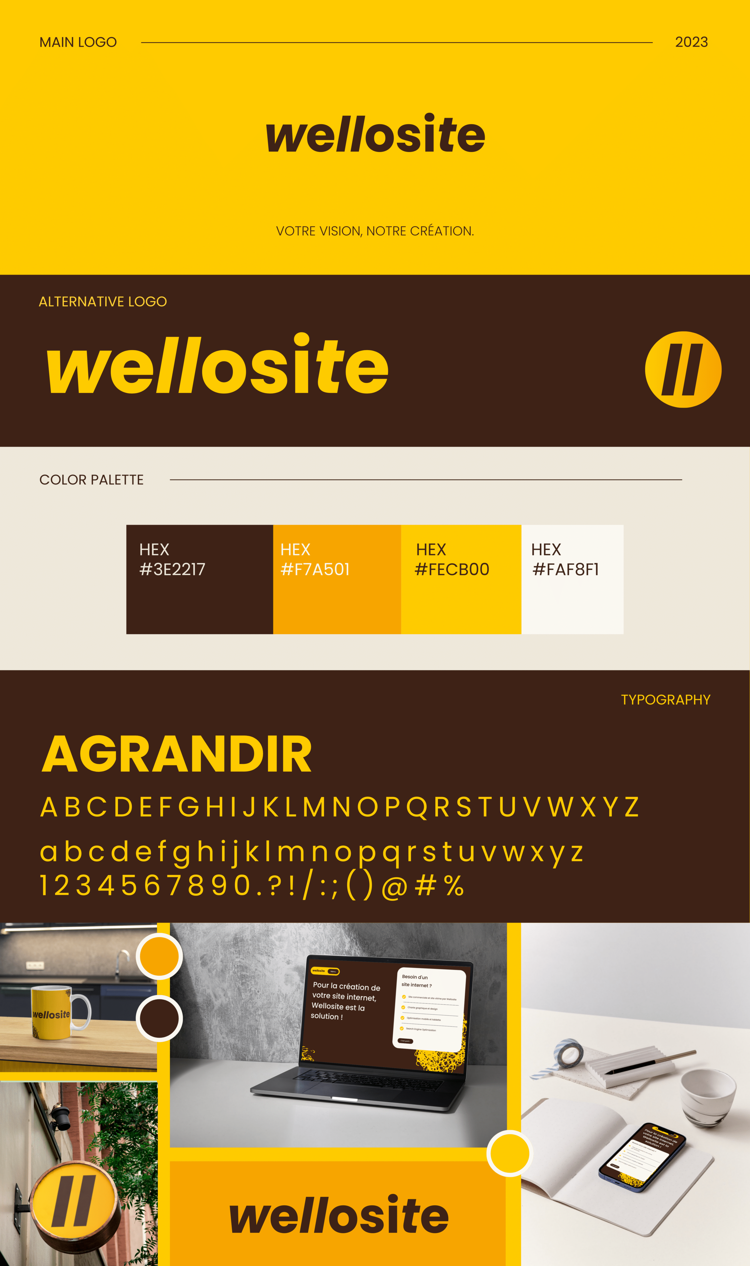
Branding
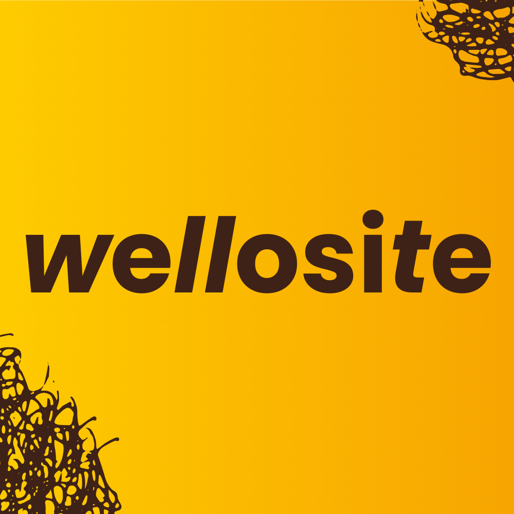
For the Wellosite brand, I envisioned a fusion between sunflowers and websites. This concept guided my color choices: warm yellow-orange hues for illustrations and graphics, drawing inspiration from sunflower petals. To create contrast, I selected a deep brown, reminiscent of the sunflower's central disk, while a very light beige serves as the background color.
The logo design plays with the two "l" letters in Wellosite, stylizing them as forward slashes. This subtle nod to programming syntax — commonly seen in URLs, JavaScript, PHP, and other coding languages — reinforces the brand's identity as a web development agency.
- Imagination
- Canva