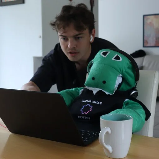
The memorable website playbook: how I redesigned Kai's whole site with Claude, no Figma
How I rebuilt every page of hirekai.ai with Claude Code on top of a brand system built for agents: the page-structure method, the inspiration workflow, the costs, and the mistakes.
Hey!
My name is Lambert. I’m 23 years old, and I run growth at Morgen, where we’re building Kai, an AI executive assistant.
A few months ago I wrote about the AI-native website stack: knowledge base, design tokens, Claude Code, Next.js, Vercel. That article was about the machine. This one is about the part the machine can’t give you for free: how you make a website people actually remember.
Because here’s the uncomfortable truth about 2026: everyone ships fast now. Everyone has a clean landing page. Claude can one-shot a “beautiful” SaaS site in an afternoon, which means a beautiful SaaS site is worth nothing. It looks like everyone else’s beautiful SaaS site.
I just finished redesigning the entire Kai website with Claude Code, every page, no Figma, while the product is still in beta. This article is the full playbook: the thinking, the brand system that makes it possible, my actual process, the costs, and the mistakes.
This article is for you if:
- You build websites with AI and they all come out looking “fine” and forgettable
- You’re a founder or marketer wondering if brand is worth investing in pre-revenue
- You want a concrete picture of what “give your brand to agents” actually means
- You’re about to redesign a site with Claude and want to skip my mistakes
Let’s go.
Part 1: Memorable, not beautiful
When everything else is automated and every product demo looks impressive, two things are left to compete on: your communication and your brand. What do people feel when they land on your site, and do they remember you a week later?
There’s a story from Steven Bartlett (Diary of a CEO) that stuck with us. The best investment he made in his early marketing agency was a huge blue slide in the office. It made zero sense. People would walk in and ask why there’s a giant slide and no monitors. And that was exactly the point: if a team puts this much effort into a slide, imagine the effort they put into the actual work.
A website works the same way. When someone lands on your site and every scroll has a moment that makes them go “wait, that’s cool”, they think: if these people care this much about a feature page, the product must be insanely good. That’s the bet. Not beautiful. Memorable.
The problem: memorable is exactly what AI doesn’t give you by default. Default AI output converges to the average of everything it has seen. So before any page got designed, the taste had to be built and encoded. That’s the brand system.
Part 2: A brand system built for agents
The brand project ran before the redesign, led by Jim and David together with Dave Officer, the brand designer behind Doodlejuice. It’s the foundation everything in my process runs on, so here’s how it works.
A designer’s brain, poured into markdown
David found Dave on LinkedIn, through a video of him rebranding a toilet paper company. That video was enough: this guy is creative, and he barely works in tech, so he isn’t biased by what every SaaS site looks like.
The brief was loose: a few brands we liked (PostHog, Dave’s own site), one adjective that kept coming back, familiar (it should feel like an old friend you haven’t seen in years), and a mascot. Dave came back with two full directions: one warm and hand-drawn, one darker with a ghost-like logo. We merged them, the ghost became the mascot. Fun fact: at a hackathon, people kept saying the logo was missing something, so Dave opened Paint, added two eyes, and Kai the character was born.
Then came the unusual part. Instead of the classic 50-page brand PDF that nobody ever reopens, we asked Dave for instructions for agents: for every asset, write down in plain text why he made it and how. The idea, the creative process, the rules.
What landed in the repo is 13 markdown files. Not mockups. Rules:
- Color palette: every color with its exact CSS token, and hard rules like “we use cream, never white”, with the reasoning written out.
- Typography: three fonts and the logic behind each. Our display font MONTI has a special rule: when text is set in MONTI, it means Kai himself is speaking.
- The mascot: 25 states across two rendering modes, with a personality doc that defines where the warmth ends and the snark begins.
- Logo system, tone of voice, manifesto, campaign thinking: the “why” behind everything, not just the assets.
When Claude reads “cream, never white” next to the exact token value, it stops guessing. That’s when a brand becomes infrastructure.
The generation pipelines
Dave is a freelancer: he ships the system and moves on. To keep his hand without keeping him on payroll, the team built pipelines on top of his files:

- Flux LoRAs trained on fal.ai on his 14 marketing icons and 12 hand-drawn illustrations. Prompt “hand-drawn illustration of a tea cup”, get four on-brand variants in three minutes, for roughly $0.05 per asset.
- A deterministic icon composer: any icon from an open library, redrawn with Dave’s exact treatment. His 22 hand-drawn icons became 137.
- A Lottie rig with the mascot’s geometry locked in code: describe a motion (“Kai does a breakdance move”), get a brand-correct animation.
Concrete output: when we invited the first 1,000 people from our waitlist, the email had a custom illustration of a door opening with Kai saying “You made it, come on in”, in MONTI. Every piece generated by the pipelines, indistinguishable from Dave’s hand.
That’s the machine I had in my hands when the redesign started. Now, my part.
Part 3: The redesign, step by step
I redesigned every page of hirekai.ai with Claude Code. Planned: 4 to 5 days. Reality: about 10. Here’s the process I’d recommend, which is not exactly the order I followed:

1. Lock the site map
Kai touches calendars, email, meetings, tasks, integrations. The first real work was deciding what pages should even exist, what the nav looks like, and what job each page has. Our old feature pages were written three months earlier and the product had already outgrown them. No amount of design fixes a page that describes the wrong product.
We did this as a doc, argued about it, and locked it. Boring. Essential.
2. Write each page’s story, top to bottom
This is the step I’d put in bold if I could only keep one. Before opening a single component, I write the page’s information structure: what does the visitor need to understand first, second, third, as they scroll down? Not blocks. Not layouts. The order of information.
Take our meetings page. The story I locked before designing: a short summary of what Kai does with your meetings, then what happens before the meeting (the prep), then during (transcription, notes), then after (recap, action items), then the follow-ups. That’s the order the job happens in real life, so it’s the order the page tells it. And the mascot walks with you: Kai appears along the page like the guide of the visit.
Once that structure exists as text, two things happen. Each block has a precise job (“show what happens after the meeting”), which makes the design brief for Claude ten times sharper than “make a nice section”. And you can judge a draft block objectively: if it doesn’t advance the story, it’s decoration, and it goes.
3. Build a swipe file, with AI doing the legwork
Memorable doesn’t mean invented from zero. Before and during the design, I built a swipe file of sites and blocks that made me feel something, and I used AI to make that collection big and cheap:
- Claude deep research to sweep the web for memorable SaaS and studio sites, with the brief “sites people screenshot and share, not sites that win awards”.
- The Mobbin MCP plugged into Claude, to search real production screens and flows by pattern, straight from the conversation where I was designing.
- My own bookmark pile, collected over months: Gumroad, Tally, Vellum, Town, Flying Papers, Get Hyped, 30 Minutes to President’s Club, Perfect Wiki, Byooooob. Wildly different products, same property: you remember them.
The rule that makes a swipe file safe when your brand is locked: steal structure and interaction, never style. The palette, the type, the mascot are non-negotiable, they come from the brand files. What I take from an inspiring block is the way it sequences information, a scroll behavior, a layout rhythm. Claude then rebuilds the idea inside our tokens, so it lands on-brand by construction.
4. Design blocks freely. The design system comes LAST
This was my biggest mistake. I started by building a design system, because that’s what you’re supposed to do. Days in, the result was generic. Here’s why: a design system is the enemy of memorable when you build it first. If every page assembles the same reusable blocks, every page looks the same, and you’ve automated your way back to a forgettable website.
The order that works: design free, polish blocks per page until they’re unique and great, and extract the system afterwards, once you know what deserves to be systematized. The middle ground I landed on: a small sandbox where I design blocks against the brand tokens, then import them into pages. Freedom first, convergence later.
My quality bar was simple: at every scroll, I need a small “wow” moment. If a block doesn’t make me feel anything, it gets reworked. Some single blocks took me two or three hours and dozens of iterations with Claude. There’s an entire dark version of the site and an entire colorful version that nobody will ever see. That’s not waste. That’s the actual cost of taste, and at Claude prices it’s the cheapest it has ever been.
One trick that made blocks better: every block has to say something about the product. A gorgeous block that communicates nothing is decoration. The best blocks on our site show Kai doing the actual job: you’re asleep, Kai reads an email, drafts the reply, tells you about it in the morning.
5. Write your design rules as text
As decisions accumulated, I wrote them down as rules in the repo, same philosophy as Dave’s brand files: MONTI means Kai is speaking. Maximum one pill badge per page. All FAQs share one exact style. And so on.
6. Let Claude audit the site against the rules
Then the payoff: I asked Claude to audit the entire site against the rules file. It caught every inconsistency I’d introduced during ten days of iteration. This loop (rules in markdown, agent audits site) is the single most AI-native part of the whole project, and you can’t do it if your rules live in your head or in Figma.
7. Ship everything at once
No page-by-page dripping. One merge: all pages, new nav, new blocks. Before it: mobile pass, performance pass (Lotties and big color plates are heavy), SEO pass (internal links, metadata, redirects). The same discipline as any migration, because a redesign that tanks your rankings is a very expensive redesign.
And the meta-lesson that explains my 10-days-instead-of-5: don’t iterate alone. I polished blocks for days without showing anyone, and you lose the ability to tell “good” from “I’ve stared at this too long”. David’s fix: when you’re blocked, park it and switch projects until someone can give you real feedback. Better: a daily checkpoint where the team sees the preview link, whatever state it’s in. With AI speed, a feedback loop measured in days is the bottleneck.
Part 4: What it cost, honestly
Receipts, because a playbook without numbers is a motivational poster:
- Timeline: rebrand decision April 13. Dave’s system delivered May 13. Brand live on the site May 14, in one pull request. Full site redesign shipped in June. Roughly two months from “we need a brand” to a fully redesigned live website.
- Before: ~10,600 lines of per-page CSS against ~500 shared. 17 different card styles, 13 button variants, three copies of the same CTA. Claude would “fix” a component and the fix wouldn’t propagate anywhere.
- After: one token file as the source of truth and a 76-block library across 12 families.
- Asset cost: about $0.05 per generated image, $0 per composed icon or animation.
- What’s still ugly: for weeks after the rebrand, the migration was only ~60% done, with hundreds of legacy color tokens still load-bearing in the codebase. Shipping the brand and finishing the migration are two different projects, and the second one is easy to postpone forever.
The website is live at hirekai.ai. Judge for yourself whether we cleared the memorable bar.
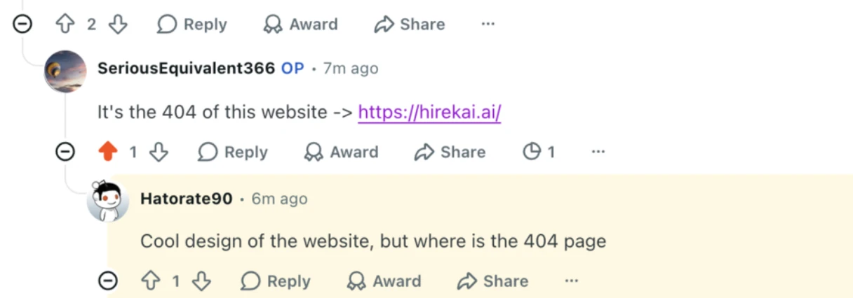
The first unprompted verdict came from a stranger on Reddit, in a thread that had nothing to do with us:
The playbook, compressed
- Aim for memorable, not beautiful. Beautiful is free now, which makes it worthless.
- Get a real creative to build the foundation. AI scales taste, it doesn’t create it.
- Change the deliverable: creative rationale and rules in markdown, not a PDF.
- Build generation pipelines on top so the brand produces assets forever, for cents.
- Lock the site map, then write each page’s story top to bottom before designing anything.
- Build a swipe file with deep research + Mobbin; steal structure, never style.
- Design system LAST. One wow per scroll. Rules as text, agent audits, ship all at once.
- Get feedback daily. Solo iteration is the real cost center, not tokens.
We tell the whole story, with the actual screens, in episodes 4 and 5 of How We Grow, the weekly show where Jim and I document how we grow Kai from zero. Come say hi.
If you’re building something similar, or you think investing in brand pre-revenue is stupid, tell me why: LinkedIn.